






Newsletter Subscribe
Join thousands of readers who get our Sunday Briefing: one email, five essential stories, zero fluff. Subscribe NOW!
Ignoring accessibility-first tooltips in WordPress isn't just lazy design; it's a massive professional failure that leaves your site vulnerable to lawsuits and alienates users.
I sat through a deposition once where a developer tried to explain that a tooltip was “just a visual aid.” The judge wasn’t buying it. Neither was the plaintiff who couldn’t submit their payroll form because a hidden overlay blocked every key action. That day, I learned that ignoring accessibility-first tooltips in WordPress admin isn’t just lazy; it’s a direct path to a courtroom.
Most devs treat WordPress accessibility standards like an annoying tax. They build the shiny interface, ship the feature, and promise to patch the UI later. That “later” never comes. We prioritize speed, we ship broken code, and then we act shocked when the lawsuits arrive. In 2025 alone, over 5,000 digital accessibility lawsuits hit American businesses. Ignoring user agency isn’t a design choice. It is a massive professional failure.
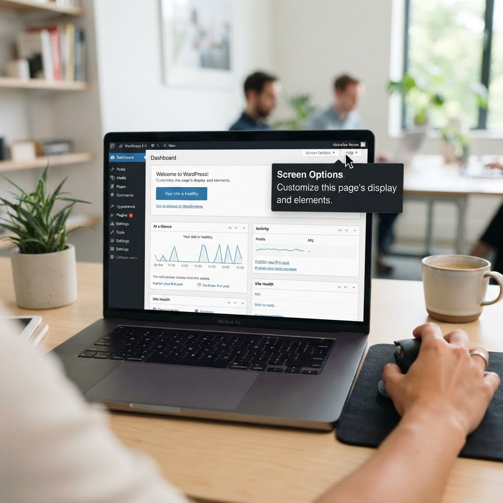
Look at your current dashboard. Are those tooltips actually useful? Most of them are glorified, inaccessible junk. They pop up at random intervals, flicker when you move your mouse, and vanish the second you try to click them. They rely on the archaic title attribute, which is a nightmare for anyone relying on screen reader friendly tooltips. This isn’t just bad design. It is hostile.
Shift your mindset right now. Accessibility isn’t a bolt-on feature. It is a core design constraint. When we build inclusive admin design, we stop asking “how can we make this look cool?” and start asking “how can everyone actually use this?” We need to treat screen reader support as a foundation, not a patch. If your tooltip design requires a mouse to work, you have already failed the baseline of WCAG compliance WordPress requires for professional software.
I once audited a plugin where the tooltips used absolute positioning to hide content off-screen. Every time a user hit the tab key, the focus flew into the ether. Standard libraries often fail because they don’t account for focus management. They assume the user is a sighted person with a mouse. That is a dangerous, elitist assumption. When your library hides the state change from the browser, you break the interaction design for every power user.
Stop using the title attribute. It is dead. Use proper ARIA attributes to tell the assistive technology exactly what is happening. Use aria-describedby to link your tooltip to the input field. If the tooltip is visible, it must have an explicit role. If it is hidden, keep it hidden from the accessibility tree entirely. This is standard stuff, yet I see it ignored in almost every custom admin project I review.
If I can’t reach your tooltip with my tab key, it doesn’t exist. Many developers create “keyboard traps” where the focus gets stuck inside a modal or a hidden div. Users with motor disabilities get stranded. You must ensure that the tab order is logical and predictable. Test it yourself. Unplug your mouse for an hour. See how long you survive inside the WordPress dashboard.
Does your user actually need that tooltip? Often, we add them because we are bad at writing interface labels. If you need a long paragraph to explain what a button does, fix the button label. Stop using tooltips to mask poor UI. Every extra element adds cognitive load, making the interface harder for everyone, especially those with cognitive disability support needs.
Build your components to be persistent and hoverable. WCAG 1.4.13 is clear. If a user triggers a tooltip, they should be able to move their mouse over it without it disappearing. It must remain active until the user moves the focus away or hits escape. This requires clean, semantic HTML that doesn’t rely on fragile JavaScript hacks. Don’t hide the tooltip in the DOM when it is invisible. Keep it there, manage its state, and keep it accessible.
Automated scanners are okay for catching low-hanging fruit. They miss the context. Manual testing is the only truth that matters. If you can’t navigate your own admin panel using only your keyboard and a screen reader, you are not done. Invite people with lived experience to break your code. They will find the gaps your automated tool missed in ten seconds flat.
Accessibility isn’t a “nice-to-have.” It is the bare minimum for professional software. We talk about quality as if it’s optional. It isn’t. When we ignore these standards, we tell our users they don’t belong in our software. Stop building trash and start building for humans. Fix your tooltips, audit your focus order, and start taking responsibility for your code.
Take a hard look at your current admin screens today. Are they truly accessible? Test your inputs right now. If you find a gap, document it, report it, and fix it before the next release. If you have a specific horror story or a win regarding admin accessibility, share it in the comments below. Let’s make the web a place where everyone can actually do their work.