







Newsletter Subscribe
Join thousands of readers who get our Sunday Briefing: one email, five essential stories, zero fluff. Subscribe NOW!
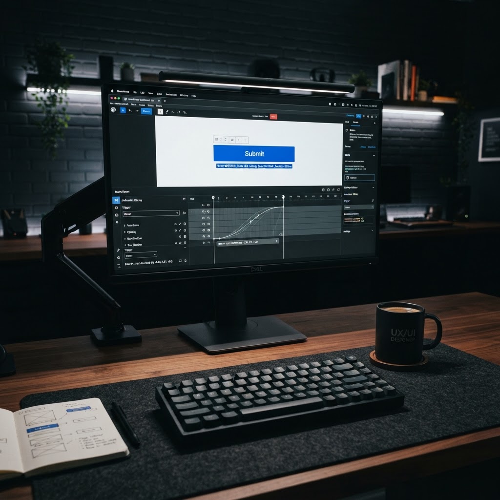
Stop polishing the turd. Your micro-interactions in Gutenberg should serve a purpose or they should not exist. When you focus on clarity, performance, and accessibility, you create a site that actually works.
Talking Points:
* The reality of over-designed interfaces
* Why simple is better than fancy
* Ignoring the user for the sake of trends
I saw a site yesterday that looked like a fireworks display at a funeral. Buttons jumped around, text swirled in, and I spent ten seconds just trying to find the contact link. Nobody wants that. Stop polishing the turd. If your site needs a flashy transition to be interesting, your content is probably garbage.
Micro-interaction implementation in Gutenberg has become a playground for people who think motion equals quality. It does not. Users want to get things done without fighting their own screens. A button that bounces when you hover over it? Cute for a portfolio, annoying on a business site. Keep it quiet.
Talking Points:
* Avoiding the trap of trends
* Prioritizing function over form
* The cost of unnecessary motion
Designers love showing off, and developers love building cool toys. They look at Dribbble and think every click needs a reaction. This is how you kill conversion rates. If I am trying to buy a product and the cart animation makes me wait, I am leaving. That 35.2% of sessions ruined by frustration is real.
WordPress block development should be about speed, not style. We forget that the average human has the attention span of a goldfish. If your CSS transitions WordPress blocks take longer than a blink, you have already failed. Stop adding junk to your code. It bloats your site and makes you look amateur.
Talking Points:
* Feedback loops for user success
* Reducing the mental work of navigation
* Signaling system status clearly
A good interaction tells the user something happened. Clicked a submit button? Show a spinner. Hovering over a link? Subtle color change. That is it. Do not overthink it.
Functional animation is about clarity. It confirms a choice without being a distraction. If your design needs a manual, it is broken. Keep your feedback loops tight and invisible.
Talking Points:
* Working with block logic
* Keeping the editor clean
* Avoiding excessive decoration
Gutenberg is a tool, not a canvas for your artistic ego. When you stuff it with custom React components WordPress that do nothing but spin, you break the workflow. I have seen developers ruin a perfectly good editor experience with useless hover effects on blocks. It is infuriating.
Improving WordPress UX starts with respecting the editor. If your blocks are slow, the site owner will stop using them. Keep them fast. Keep them simple. If you cannot explain why an animation exists, delete the code.
Talking Points:
* JavaScript overhead concerns
* Impact on mobile users
* Perceived performance vs actual speed
Mobile users are fickle. If your site does not load fast, they disappear. 53% of mobile visitors walk away if a page takes more than 3 seconds. Your fancy custom animation is a direct line to a higher bounce rate.
Web animation performance matters. If your JavaScript execution is too heavy, the main thread hangs. The user thinks the site crashed. They leave. You lose money. Stop building bloatware.
Talking Points:
* Efficient use of state management
* Avoiding layout shifts
* Handling component lifecycle properly
You do not need a massive library for every hover effect. Most of the time, CSS transitions are enough. If you find yourself writing complex state management logic for a simple button flip, step back. You are over-engineering a problem that does not exist.
Custom React components WordPress should handle logic, not just look pretty. Think about the component lifecycle. Do not trigger re-renders just for a fade. Efficiency is the mark of a pro. Lazy developers add libraries; good developers write clean code.
Talking Points:
* WCAG compliance basics
* Sensory alternatives for movement
* Testing with keyboard navigation
Accessibility is not a suggestion. If your micro-interactions break for keyboard users, your site is a failure. Avoid jarring motion that triggers vestibular issues. Web accessibility standards are there for a reason.
Provide clear UI feedback loops that do not rely on sight alone. If a hover menu requires a mouse, you have excluded a massive group of users. Test your blocks. Use a keyboard for an hour. You will be shocked by how much you get wrong.
Talking Points:
* Scaling code effectively
* Independent component maintenance
* Avoiding monolithic dependency hell
I hate monolithic blocks that do everything. They are a nightmare to debug. When you build with a modular strategy, you can fix one thing without breaking the whole site. Gutenberg interactive blocks should follow this pattern.
Keep your logic small. If a block is too big to test easily, split it up. You will thank yourself later when a plugin update does not blow up your entire front end. Modular code is sustainable code.
Talking Points:
* Real-world performance testing
* A/B testing user behavior
* Identifying friction points early
Designers live in a world of static screens and high-end internet. Your users live on a subway with bad Wi-Fi and a three-year-old phone. Test your work on the hardware that actually matters. A/B testing can show you exactly how much your fancy animations are hurting your sales.
I have seen 300% conversion jumps just by turning off intrusive animations. Do not guess. Check the data. If the numbers say users hate your sliding modal, kill it. Ego is the enemy of profit.
Talking Points:
* Analyzing past mistakes
* Learning from bloated sites
* Pivoting to minimalist design
I remember a project where we spent weeks on a complex, animated hero block. We loved it. The client loved it. Then the heatmaps arrived. Nobody clicked the button because they were too busy waiting for the text to settle. We cut the animation, and conversions spiked.
That was a hard lesson. Stop designing for Dribbble. Start designing for people who want to buy, read, or sign up. If you are not solving a problem, you are just making noise.
Stop polishing the turd. Your micro-interactions in Gutenberg should serve a purpose or they should not exist. When you focus on clarity, performance, and accessibility, you create a site that actually works. Stop chasing trends and start chasing results. How have you cleaned up your own block development habits? Share your thoughts below.