


Newsletter Subscribe
Join thousands of readers who get our Sunday Briefing: one email, five essential stories, zero fluff. Subscribe NOW!
Join thousands of readers who get our Sunday Briefing: one email, five essential stories, zero fluff. Subscribe NOW!
As WordPress evolves, each new update raises questions about progress. Are features really improving user experience, or are we complicating it? This critical examination digs into WordPress 6.3 and Gutenberg 22.6, exploring claims versus realities.
I’ve watched WordPress evolve like a teenager struggling with identity crises—awkward at times but full of potential. Statistically speaking, WordPress powers over 40% of websites today, which is nothing short of astounding. Yet, with every update, I find myself asking: Are we actually making progress?
As with every new release, the changes sow a mix of excitement and skepticism. The recent updates introduced in WordPress 6.3 and Gutenberg 22.6 boast a plethora of features. But do they align with user needs? Or are we just layering complexities on top of existing flaws?
Talking Points:
WordPress began as a no-frills blogging tool. Over the years, it has morphed into a content management giant with features that promise to simplify building and managing websites. Each iteration has seemed to promote ease of use, but looking back at historical updates, they often unravel into a mishmash of options that leave average users bewildered.
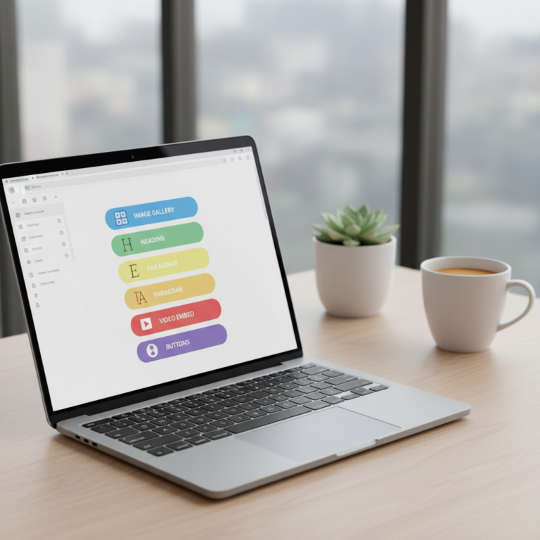
The initial simplicity has morphed into a somewhat convoluted experience. For instance, the advent of block editing with Gutenberg promised to enable creative liberty, but many users found themselves lost in a sea of blocks and styles.
Talking Points:
With WordPress 6.3, we were greeted with an entirely redesigned Site Editor. The new layout allows us to manage content and design within a single interface. Sounds great, right? But it leaves seasoned users feeling like the rug was pulled out from under them.
The pros include a more fluid experience and better content block management. But, can we really call it a step forward when some of the previous issues remain unresolved? My experience suggests that while the interface looks prettier, instinctually navigating to find commonly used features feels like a scavenger hunt.
Talking Points:
Then enters Gutenberg 22.6, claiming to bring about improvements in block management and UI. Yet, I often wonder if these enhancements merely distract from pressing grievances. For instance, while better block management may sound enticing, what users truly desire is a seamless experience.
There’s a portion of the user base that loves the direction Gutenberg is heading, while others are left frustrated, encountering new features that they didn’t ask for. Sometimes, it feels like we’re on a roller coaster—the thrill of new advancements colliding with the dread of unexpected drops.
Talking Points:
Block-based themes have risen like a phoenix, promising innovation and flexibility. However, they come with a price—a certain kind of conformity. The idea that every website can look crisp and clean is appealing, but it leads us to ask whether that actually stifles creativity.
In my time tinkering with various themes, I’ve noticed how restricting pre-defined styles can cripple unique brand identities. While block-based themes have their merits, they offer less room for the sort of individuality that drew many of us to WordPress in the first place.
Talking Points:
Ah, the distraction-free writing mode. Touted as a necessity for focused writing, it’s a feature I wasn’t initially sold on. Sure, fewer options on the screen seem ideal for avoiding distractions, but isn’t that also just a way of dumbing down the experience?
While some users find it beneficial to strip the clutter, others, including myself, feel a pinch of concern: does that simplicity compromise usability? If the ultimate goal is to engage deeply with your content, can one really do so without access to a full range of tools?
Talking Points:
Openverse. It’s hailed as a treasure trove of media resources, ready to fuel creativity. The promise is enticing—immediate access to visuals and audio that can elevate any piece of content. But wait; do we fully understand the implications of using freely available media?
In my exploration, mixing Openverse assets sometimes introduces complexities around licensing. For some, the convenience can overshadow the importance of due diligence. A quick glance at the terms can save you from potential headaches down the line, yet I still see creators diving headfirst without doing their homework.
Talking Points:
This new feature, the Command Palette, aims to bring a universal command interface to WordPress users, promising efficiency in finding actions. Sounds like a dream—until you realize there’s a learning curve that feels steeper than it should.
In practice, I often wrestle with memorizing a series of commands just to perform standard tasks. While the intention is clear, in reality, it can lead to more frustration than momentum. Simplicity is key, folks, and adding layers shouldn’t overshadow that.
Talking Points:
The concept of style revisions left me scratching my head. On one hand, it’s nice to have structured options. On the other hand, did we really need yet another layer? As someone who often tinkers with styles, managing revisions seemed more like an added burden than a blessing.
What’s been clear in my discussions with peers is the overwhelming sentiment: many don’t see the need for such a feature. We already have version control, after all. Are we complicating what could be straightforward?
Talking Points:
The media tab improvements appear to cater specifically to those who thrive on visuals. However, for many average users (myself included), the media section feels overloaded. Sure, it’s convenient to have everything in one place, but is that really practical?
The struggle often rests in deciding whether “convenience” translates to a smoother workflow or if we’re simply creating a labyrinth of options that ultimately confound.
Talking Points:
Header and footer patterns reflect the trend towards conforming design principles in the WordPress ecosystem. By offering templates, WordPress allows users to create quickly, but it also seems to stifle creativity. Finding oneself in a sea of the same designs isn’t exactly invigorating for those pursuing uniqueness.
As one who has tried to stand out, I’ve often opted to stray from patterns. Yet, I can’t ignore that for many, these templates provide a necessary shortcut. There’s a balance to be struck, but I fear we’re losing it.
Talking Points:
Finally, let’s chat about custom CSS support. What could be more empowering than tweaking styles to make your site truly yours? Yet in practice, I often feel that reliance on presets can lead to a dependency that limits individual creativity.
I’ve wrestled with using themes that impose their designs—not allowing me to deviate enough. As great as it is to have some freedom, it often feels like we’re merely putting lipstick on the proverbial pig.
WordPress continues to innovate—but at what cost? With every iteration, it seems the balance between simplicity and complexity is increasingly precarious. These updates introduce features that aim for efficiency, yet they often lead us into an intricate web of options that can drown creativity.
In this swirling storm of updates, I encourage you to critically assess what truly serves your needs. Do these new features empower you, or do they complicate your user experience? Share your thoughts! Join the conversation, and let’s navigate this together.
WordPress 6.3 introduced a revamped Site Editor, enhanced block management, and a new command palette, aiming to streamline user experience while offering more creative flexibility.
It can be beneficial for some users as it minimizes distractions, but others find the lack of features limiting. It ultimately depends on how you prefer to create your content.
Openverse offers easy access to free media, but users need to be cautious regarding licensing and copyright to avoid potential issues down the line.
The command palette is a universal command interface introduced in WordPress 6.3 that aims to streamline navigation and access to commands, but some users find it complicated to use effectively.
While block-based themes provide user-friendly options for design, they can sometimes limit individuality, pushing users toward a more uniform aesthetic that may not reflect their brand’s distinctiveness.